This week let's talk about color usage in games.
Colors serve a multi-function role in video games, from visual cues for as what to focus the eyes on, to separating similar but distinct onscreen elements, to aiding in the illusion of depth and space in a 2D plane. Additionally, colors can be used to unify the whole 'feel' of a game, carry over subtle meanings and messages, and (obviously) just help make things look good.
Focus
In video games, it's the same idea. Certain colors can be associated with points to go towards or hidden areas. For example, Mirror's Edge has certain objects turn red as the player approaches them to show that running along a pipe or steel girder is the way further forward in the game. Otherwise red objects are fairly rare in the game's mostly stark white environments, serving to reinforce this 'red means go' mentality (Madigan, 2013).
 |
| Notice the red objects forming a path to run through. Screenshot by Marc Chea |
Element Separation
Along with directing the players' eyes towards important parts of the game, color can help to make distinct the differences between objects or places in game. The most obvious example is, of course, team color (Admin, 2014).
Nobody wants to shoot the people on their own team (except griefers, but we hate those guys anyway), and color helps to prevent any sort of mix-up that could possibly happen due to similarities between opposing teams. Say that there are two players that are both playing a knight class or something similar in some sort of team based game. The character models are virtually identical save for one thing - color. This is enough to allow others to quickly recognize and assess most any situation.

Depth
This is one more for 2D games but can also work with 3D stuff as well.
Everything we see is an illusion. We think we view things in three dimensions but in actuality our vision is a two dimensional plane that we retrieve 3D information from by way of subtle cues in shadow, shape, and color.
A very good way to give an illusion of depth is contrast. Edges where two colors or shades meet help us determine between foreground and background. It doesn't matter much as to whether the foreground is lighter or darker than the background because that is determined by the context in which the colors are presented. For example, a small dark dot (object) in a white plane (context) is seen to be in the foreground. The inverse is also true, a small white dot (object) in a dark plane (context) is seen to be closer in the foreground (Admin, 2014).
Theme
Color is also a good influencer of the mood and feel of a game. I'm pretty sure this is already widely known but I'll write about it anyway.
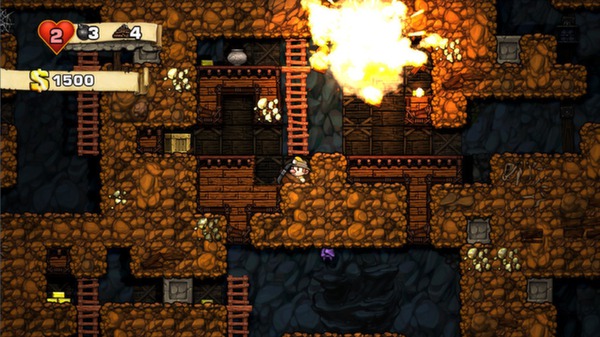
Colors have different meanings. You want a nice happy game, then use bright, light, and pastel colors. You want a dark game, use muted, low saturation, and darker shades. It's fairly straightforward. Here's a basic list of colors and their meanings:
- Red - intensity, heat, passion, danger, aggression, power
- Orange - aggression, energy, heat, enthusiasm, quality
- Yellow - happiness, warmth, joy, energy, lightness
- Green - growth, safety, fertility, restfulness
- Blue - calm, stability, loyalty, intellect, truth, seriousness
- Purple - luxury, power, mystery, royalty
- White - purity, truth, clean, innocent
- Black - power, mystery, evil, elegance, death ("Color Wheel," n.d)
 |
| Screenshot by Marc Chea |
 |
| Screenshot by Marc Chea |
 |
| Screenshot by Marc Chea |
 |
| Screenshot by Marc Chea |
You get the idea.
-Marc
---
Sources:
Admin. (2014). Color Theory For Game Design 1 of 4 - Fundamentals. How Not To Suck At Game Design. Retrieved from
http://howtonotsuckatgamedesign.com/2014/11/color-theory-game-design-1-fundamentals/
Color Meaning. (n.d.) Color Wheel Pro. Retrieved from
Madigan, J. (2013). Why Do Color Coded Cues in Level Design Work?. The Psychology of Video Games. Retrieved from
http://www.psychologyofgames.com/2013/09/why-do-color-coded-clues-in-level-design-work/
Westbrook, L. (2010). Deus Ex: Human Revolution Director Explains Game's Symbolic Colors. Escapist Magazine. Retrieved from
Image sources:
[Screenshot of a level in Spelunky]. Retrieved March 6, 2015, from: http://cdn.akamai.steamstatic.com/steam/apps/239350/ss_8fb56a4fb17d6c777c12952d6642652b063b5528.600x338.jpg?t=1397110636
No comments:
Post a Comment